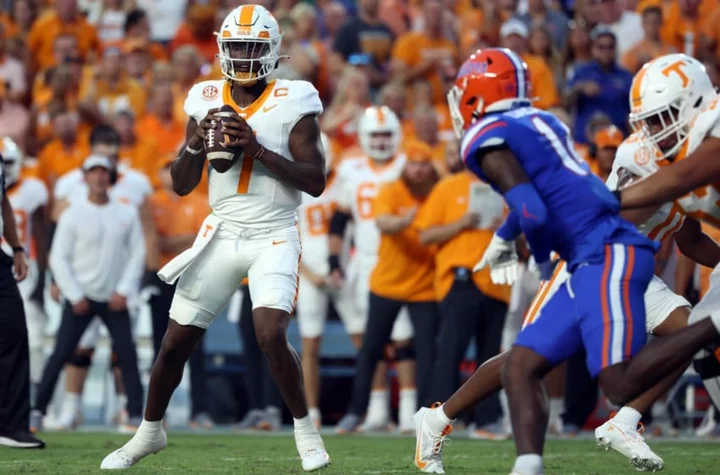
Tennessee fans are done with Joe Milton after terrible first half vs. Florida
Tennessee Volunteers fans were calling for quarterback Joe Milton to be benched after a rough first half against the Florida Gators on Saturday.
2023-09-17 09:45
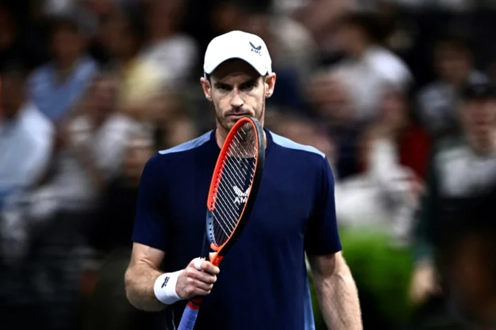
Injured Murray out of Davis Cup clash with Djokovic
Former world number one and three-time major winner Andy Murray pulled out of the Davis Cup finals on Saturday, depriving the tournament of a likely...
2023-11-18 19:58
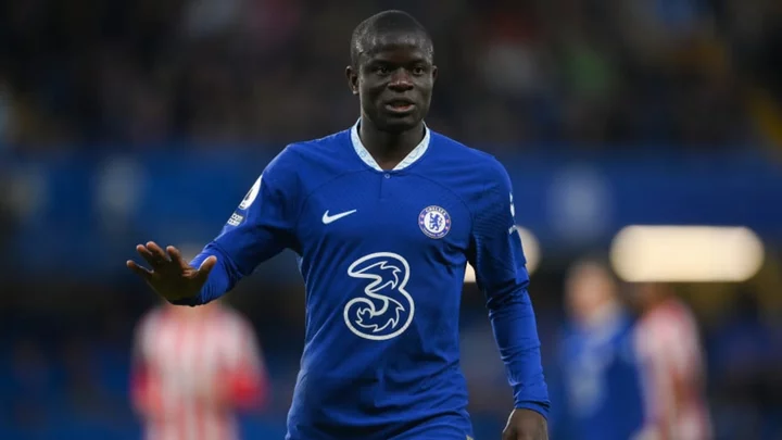
N'Golo Kante completes move to Al Ittihad
N'Golo Kante has left Chelsea and completed a move to Saudi Pro League champions Al Ittihad.
2023-06-21 15:16
Spain and Italy step up chase of runaway Euro leaders
Spain crashed in six in Euro 2024 qualifying on Tuesday while Belgium were also big winners as Italy revived their campaign and Austria and Switzerland...
2023-09-13 06:46
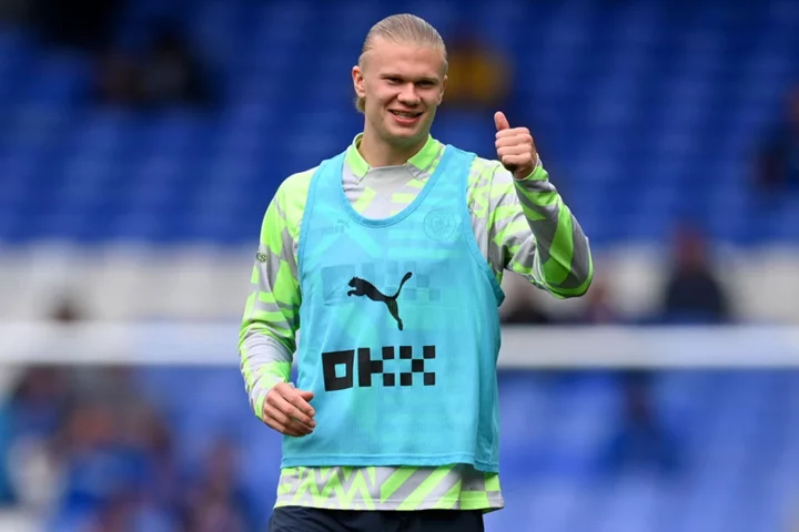
Everton vs Man City LIVE: Score and latest updates from Premier League as Erling Haaland starts
Follow live coverage as Everton face Manchester City in the Premier League today. Manchester City manager Pep Guardiola, with one eye on next week's Champions League semi-final second leg against Real Madrid, made four changes for the trip to Everton. Kevin De Bruyne, John Stones, Jack Grealish and Bernardo Silva all dropped to the bench after the 1-1 draw in the Bernabeu, with Aymeric Laporte, Riyad Mahrez, Julian Alvarez and Phil Foden coming in. Everton made one enforced change from Monday's surprise 5-1 win at Brighton with Mason Holgate coming in for absent left-back Vitalii Mykolenko. We will bring you all the action and updates from today's game in the live blog below:
2023-05-14 21:28
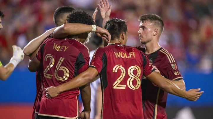
Atlanta United settle for 2-2 draw with FC Dallas
Atlanta United came away with a point after their clash with FC Dallas.
2023-09-04 21:55
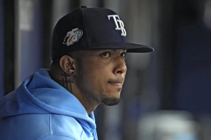
MLB looking into social media posts involving Rays shortstop Wander Franco
Major League Baseball is looking into social media posts involving Rays shortstop Wander Franco
2023-08-14 07:46
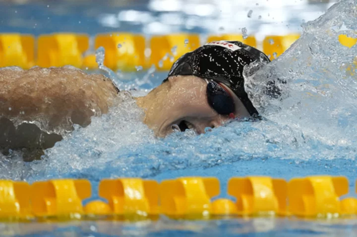
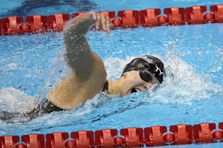
Katie Ledecky passes Michael Phelps for most individual golds at world championships
American swimmer Katie Ledecky's legacy keeps growing
2023-07-29 21:16

South Korea breezes through first day of League of Legends competition in Asian Games esports
South Korea’s League of Legends team has breezed through its first day of competition at the Asian Games and was bolstered by a strong performance by top player Lee Sang-hyeok
2023-09-25 18:49
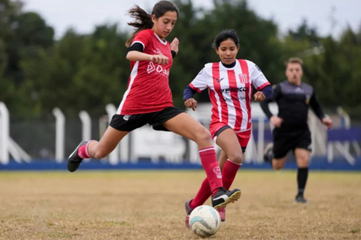
Argentina turns its attention to youth divisions in search of a Messi-like player in women's soccer
Candelaria Cabrera was the only girl playing in a boys league where she lives in Argentina back in 2018
2023-07-14 21:47
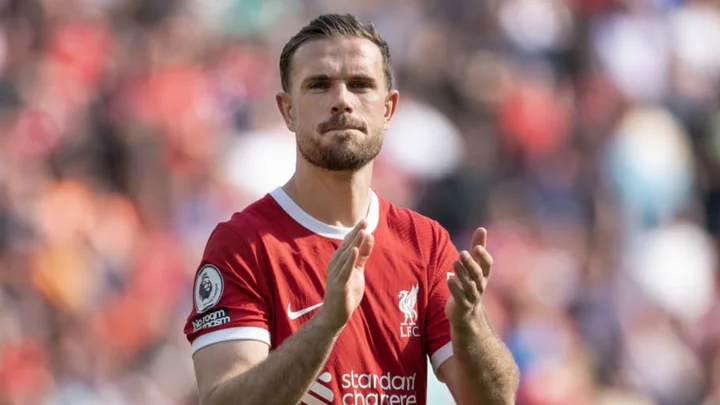
Jordan Henderson completes move to Al Ettifaq
Liverpool captain Jordan Henderson has completed his move to Saudi Pro League side Al Ettifaq, reuniting with former teammate Steven Gerrard.
2023-07-27 19:25
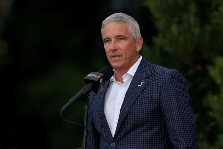
Surprise LIV Golf-PGA Marriage Risks Drawing Antitrust Scrutiny
The PGA Tour and Saudi Arabia-backed challenger LIV Golf avoided calling their proposed partnership a merger. But their
2023-06-07 19:45
You Might Like...
Kicked cooler lands Mariners OF Jarred Kelenic on IL with broken foot
Los Angeles to host 2026 Pan Pacific swimming championships ahead of 2028 Summer Olympics
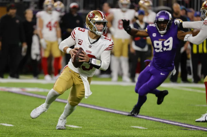
49ers QB Brock Purdy is a full participant in practice and could play Sunday following concussion

Paige Spiranac gives tips to professional and amateur golfers, fans dub her 'an excellent instructor’
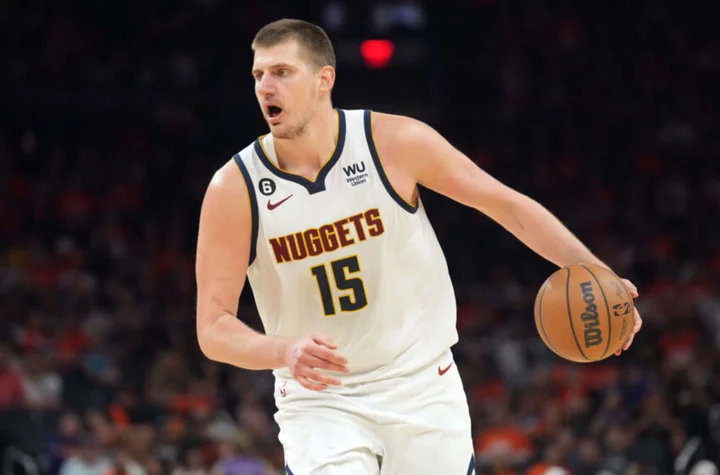
Best NBA prop bets for Lakers vs. Nuggets Game 1 (Can anyone stop Nikola Jokic?)
Rangers falter in season finale in 1-0 loss to Seattle, allowing Houston to win AL West
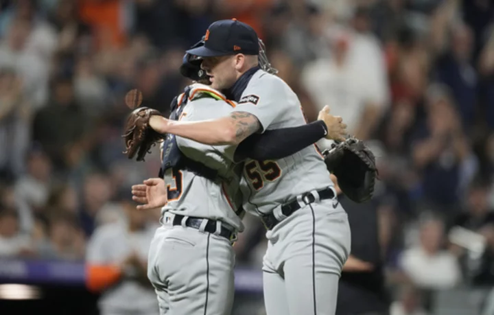
McKinstry hits 3-run homer in 10th inning, Tigers beat the Rockies 4-2
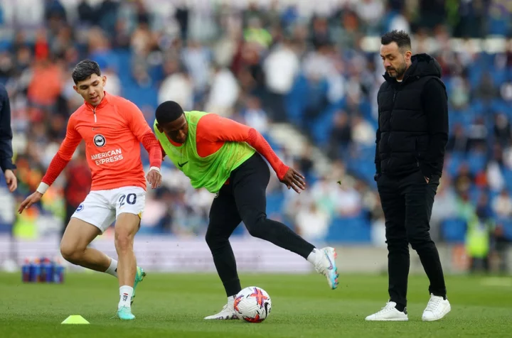
Brighton vs Man City LIVE: Premier League score and latest updates as Erling Haaland starts